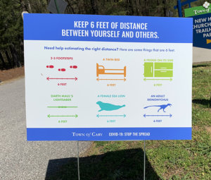
It looks like a dance chart for our post-COVID world. It’s called the SIX FOOT DANCE.
- White Papers
Public venues of all kinds are re-opening to a radically different reality, as people venture out into the public space. Old ways and patterns of doing things are now different, ranging from shopping at the grocery store, to going to a theme park. The world has changed. It matters where you put your feet. How are wayfinding and operational signage adapting to a post-COVID world of public venues?
Traditional wayfinding helps people make choices for where to go and what to do. Signs are placed at key decision points, like at intersecting paths or entry points, and reduce stress by making it clear to visitors what decisions to make and where to go.
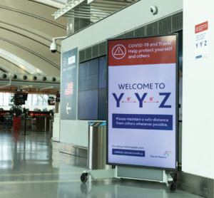
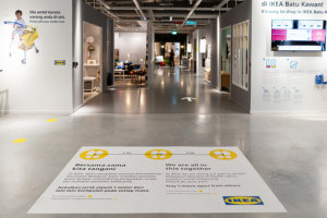
But for public spaces like parks, museums, food & beverage and retail locations to reopen, new sign types are required. Signage for social distancing markers on the ground, wearing masks in public, directing one-way traffic flow on narrow pedestrian paths, hand sanitizer stations and instructions for guests to wait in family groups are now becoming common mandates. Guess what? That means a lot more signs.
With public spaces already filled with signage and messages of all kinds, this poses a challenge. Theme parks, museums, live events, and public spaces now grapple with both directing visitors and need to change their behavior. Activities we take for granted are now obsolete or need to change. Waiting in lines for attractions could be things of the past. Teaching people to learn new patterns of behavior requires clear directions and signage.
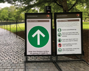
One danger is that guests get information overload/graphics fatigue in spaces now filled with new yellow, black, and red emergency signage. Too much info, blaring in the same key and intensity, is likely to be tuned out as people become desensitized to the “new normal.” It is visually overwhelming.
This creates a real problem of key messages being missed.
Critical information can be ignored, because our brains are wired to tune things out over time, due to repeated exposure. This happens in physical and digital landscapes, whether we read online dialogue prompts, hear audio messages, or see actual signage. Anthony Vance, the director of the Center of Cyber Security at Fox School, says, “it often has to do with memory… we saw it last time, so we don’t have to scrutinize it so much this time. Sometimes we remember something more than we actually see it.”1
Our human tendency is to group similar patterns, colors and typography into simple schemas, which helps the mind organize information. In graphics (and psychology) it is called gestalt theory. It is a way of sorting out and classifying the information that surrounds us. While this grouping technique simplifies our life, it can make us miss the visual informational cues that help us navigate. Information that should be differentiated gets lumped in with other directional information that seems similar.
So the challenge is to create wayfinding and operational safety signs that are “sticky” and stand out in visually disruptive environments.
Here are five tips to improving important safety graphics:
1. Fear Overkill
Avoid signs looking like strident warning signs similar to hospitals, chain-link fences on government facilities and institutions or atomic labs (unless required). People get visual fatigue with signs that blare fear in red and black. Worse yet, they tune them out.
2. “Please” vs “Don’t”
Say “Please” instead of saying “DON’T”. Give a positive incentive for the desired behavior by making it more human, instead of a command. People respond to respect.
3. Humor
Humor can attract attention and be sticky, but needs to be tempered with the seriousness of the message. A sign should leave the reader with a smile and still show a sense of care for the topic. Keep calm and carry on.
4. Don’t Cry Wolf
Warning signs can create bad choices when it overstates the risk. “A warning sign can increase danger when it overstates the danger – meaning we take less precautions if our experience and subjective perception is that the danger is usually less than stated on the sign.”²
5. Branded vs. Off-The-Shelf 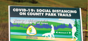
One-size-fits-all solutions from code required sign catalogs all look the same. If you need a signage solution in a branded customer facing space, design the sign for that space. Use your brand colors, fonts and imagery, (where possible) to show that this is a deliberate response, not an imposed reaction.
The right next steps:
Creating wayfinding signage as a tool to inform safety decisions is key. If you want to impact behaviors, you will need the right strategy. Assess how your clients, customers, and guests interact with the space, and see what works in similar venues. This will help you to develop a signage plan that will be visible, easy to understand, and differentiated from other competing messages.
If you need our consulting or signage design services, contact Thinkwell’s team of experienced wayfinding and location-based graphics professionals. We are skilled in developing signage solutions customized to your unique needs.
References
- Megan Alt , Tuning out Security Warnings, Temple University Fox School of Business, January 28, 2020
- Dr Robert Long – PhD, Why Do We Ignore Safety and Warning Signs – Sometimes With Tragic Results? safetyrisk.net
Related Posts
Disability Access: In It for the Long Haul
- White Papers
In May 2021, Thinkwell and RUH Global began a series...
Trend Report Deep Dive: Taming the Algorithm
- White Papers
The “Algorithm.” As a colloquial term for the recommendation engines...
Access for All
- White Papers
The wheelchair access queue line, the closed-captioning on a ride...